User Interface Feedback

Hello everyone,

I ended up pretty much taking the lead on UI/UX design for the site outside of the logo, but I have neither a background in the field nor access to the admin control panel and so there’s bound to be several things I missed or that could be improved.

As such, if you have any feedback on the site’s look across any of the four custom themes (Grey Amber is literally just a default minus the yellow header bar we added and we don’t currently plan to make further changes to it), I’d really appreciate if you could send it here so I can workshop things a bit and make improvements.

Any out-of-place colors, overlooked edge case design elements, or any weird bugs or glitches should be documented here so I can get around to addressing them ASAP. I’ll keep an updated list of known issues below, so be sure to check that for anything to avoid spamming.

Any requests for future themes should be held onto for the time being - we may expand in the future, but for now we want to make absolutely certain everything works correctly on the themes we currently support.

Thanks!

Edit: I’m not currently really supporting Vaporwave. Chloe was already handling a lot of the implementation work anyways and she’s taking the reigns on that. So if you’re one of the two people that use that, DM her - otherwise I’d prefer other UI/UX bugs and stuff go through me, she has enough on her plate.

Known Issues
Images in spoilers not respecting lightboxes

:discourse:
Image:
image

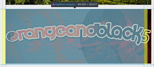
Description: Images should, in theory, be bound the the blue region, which is the lightbox it’s a part of - however, for whatever reason, images within spoilers do not stay within these bounds as we would expect. We currently believe this to be a Discourse bug and are awaiting feedback from their team.

ETA: Unknown

Workaround: The main issue this has is with mobile users at the moment. If it becomes a problem we’ll see about temporarily reverting the added indentation. In the meantime, try to avoid spoilering massive images too many spoiler layers deep.

The logo's colors are not displaying correctly across all themes

:discourse:
Image:
image image image

Description: We would like the purple logo to be standard across all themes, with a different color on legacy themes. Discourse is being very finicky with this, and it’ll take some time to figure out how to get it to work correctly.

ETA: Unknown

Workaround: Deal with it for now

1 Like

Mobile vaporwave currently looks awful, and I’ll get to fixing it within the next few days

4 Likes

Rainbow

engineer gaming

I feel like names as long as this are an eyesore, this is my first post because I’m tired.

Apart from that, I really like the UI, it’s easy to use and it makes me glad that I can just easily get around without being a large hassle as it has been in the past. It’s reminiscent of the old UI which is a fear I had when I found out about this new site.

1 Like

are you insulting the perfection of Hippopablompoyeetus

It’s still a Discourse instance, and we do even have Legacy themes if you’d prefer those, but yeah I’m pretty happy with the direction of the new themes, so thanks :slight_smile:

1 Like

I love the new dark theme. :slight_smile:

BTW, would it be possible to post a list of text colors available as a reference?

Do you mean what colors the site uses or what colors you can use?

The colors we can use for [color=?].

Any hex code works (make sure to include the # before it)

https://www.color-hex.com/

or html color names

https://www.w3schools.com/colors/colors_names.asp

5 Likes

never even put this in the known issues but

prepare to say goodbye to this background going outside of the replies thing


gonna look like this


ETA: later today I’ma go to bed rn and figure out the final touches later


here’s what the bottom ones will look like

the top ones alternate colors but since the bottom ones are contained within the post in such a way that would make attempting to not color them in a massive pain I have elected to just make them opposite of the post background color

2 Likes

when theres a --last visit-- tag, the boxes above and below it are the same color
in retrospect this is likely an intentional thing and not a bug
its fine it was just a bit weird on first notice

samples for both colors:

Not intentional

The “last visit” is counted as a child for whatever reason, and thus is included in the parts that are set to alternate

We had it as a low priority bug fix but it somehow didn’t make it onto our list lol

Not sure if its fixable but we’ll try, ty

4 Likes

when i click off of reading a topic or when i press the “x updated topics” button, the topics become blue before fading
for me, they become light blue, fade to white, then suddenly snap to whatever grey color they were supposed to be
its not like, site-breaking, but its visually distracting

you can see in this image that the topic is supposed to be the darker grey, but whn fading it fades to lighter than the grey it is supposed to be

after some tests, this is likely due to alternating box colors
this bug occurs in Dark and Light themes, where topic boxes do alternate colors
and it does not in Vaporwave and Grey Amber, where they don’t

We’d actually disabled the blue glow within a topic

Must be a different spot to disable it on other pages

loldiscourse

ftr the “somehow” is me having no time to do anything all week lol

The new Thanksgiving UI update should have just gone live.

Let me know if I missed anything or if there are any unintended consequences.

1 Like

rip blue glow on topics when exiting them
2017-2021
:pensive:

2 Likes